
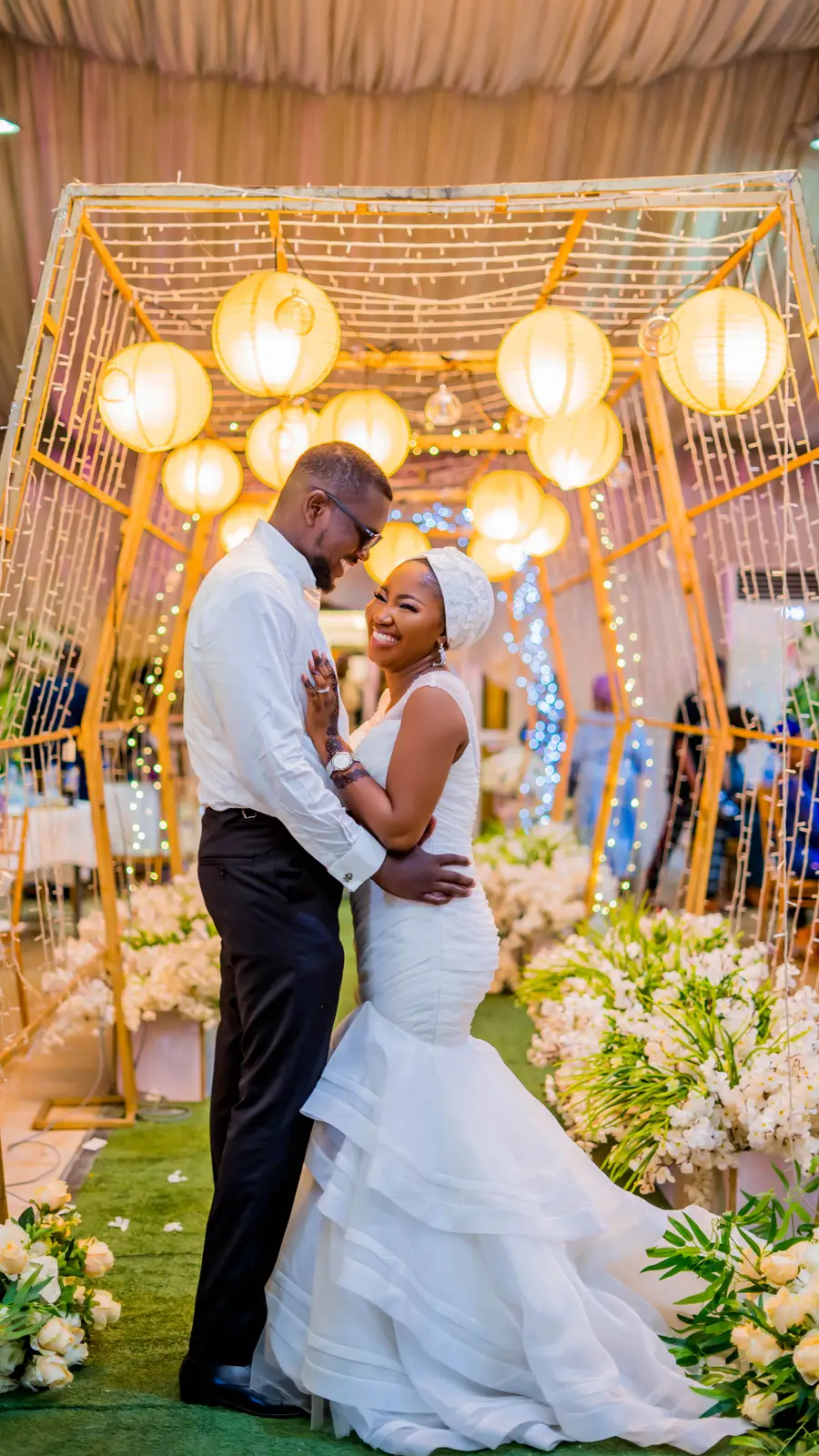
Colour is the first thing your guests feel when they walk in — before the food, before the music. A well-chosen palette ties everything together, from the invitations to the final photograph. Here is how we approach it.
Start with a feeling, not a colour
Do you want the room to feel warm and intimate, or bright and celebratory? Words come before swatches. Once we know the mood, the colours follow naturally.
Build around three roles
- A dominant colour for the big surfaces — drapery, linens, backdrops.
- A secondary colour to support it on chairs, stationery and signage.
- An accent — often metallic — for the details that catch the light.
Think about the venue and the light
Deep jewel tones look stunning in an evening hall but can feel heavy in a bright garden. We always test a palette against your actual venue and time of day.
Photograph test
Rich royal blues, warm golds and soft neutrals are perennial favourites because they hold up beautifully on camera. Trendy colours can date quickly — timeless ones you will still love in twenty years.
Want help finding yours? Enquire about our décor and styling.